en
- EN
- UA


How UX/UI Affects Conversion in E-Commerce
What shapes a positive user experience in e-commerce? It’s a complex process, but it often comes down to ease of interaction: clear navigation, a logical path to purchase, and noticeable CTAs. Read on to see how UX/UI affects conversion and how to measure its effectiveness.
UX/UI to increase conversion
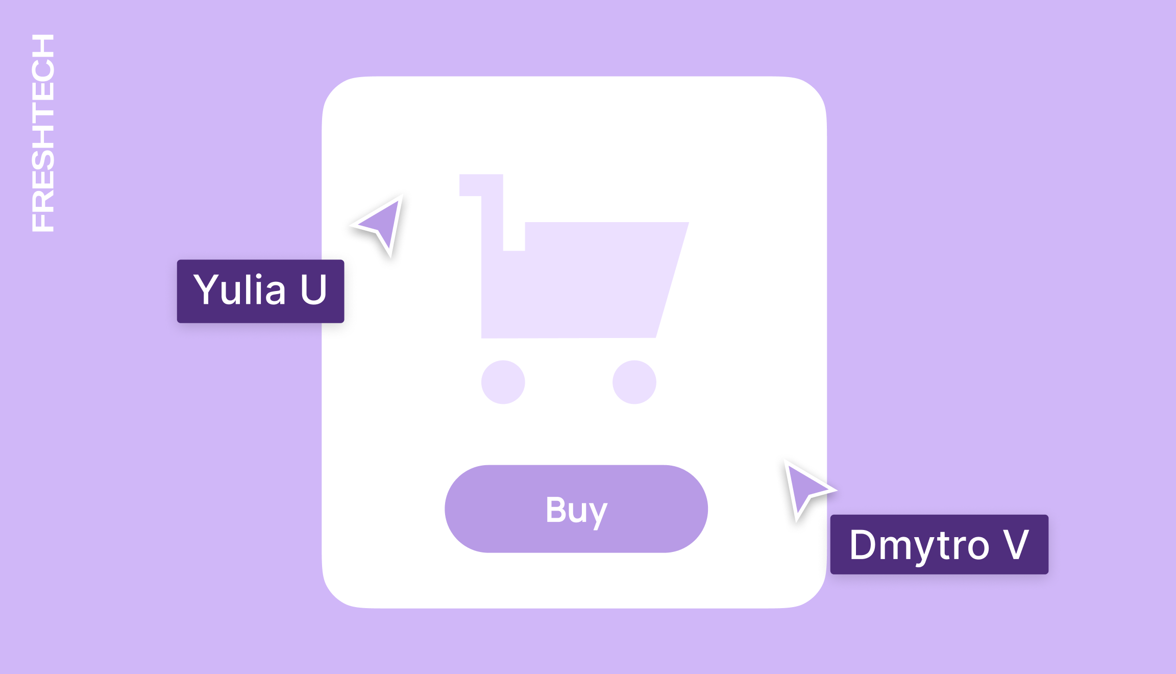
Navigation and site structure
The user journey on a site should be intuitive and clear from the very first seconds. Easy-to-use navigation, a logical structure of sections, and prominent controls reduce the time it takes to find the desired product. Categories, filters, and sorting should work without delays and deliver relevant results. A simple checkout process leads to fewer drop-offs and higher conversion rates.
Visual interface elements
The first few seconds of interaction shape how users perceive a service or product overall. The impact of first impressions is especially noticeable in the above the fold area, which refers to everything visible on the screen without scrolling. This part of the screen should showcase the main offer so users don’t have to spend time searching for key information.
High-contrast colors, clear typography, and enough spacing between elements are essential for a comfortable experience on both mobile and web. CTA buttons should be prominent without being intrusive. Icons, illustrations, and animations help users orient themselves and guide them toward completing desired actions.
Optimizing the purchase process
Оформлення замовлення — етап, на якому користувач найчастіше залишає сайт. Мінімальна кількість кроків, автозаповнення форм і чіткі інструкції скорочують час взаємодії. Важливо, щоб ціна, податки, вартість і терміни доставки були прозорими з самого початку. Будь-яка неоднозначність на цьому етапі — ризик втратити покупця.
Responsive design and speed
Since most users shop via mobile devices, websites need to load quickly and display correctly across different screens without requiring zooming. Interactive elements and clickable zones should be placed where users naturally expect to find them.
Load speed also affects user behavior: even a 2–3 second delay can significantly reduce conversion and increase bounce rates. That’s why it’s important to optimize the order in which elements appear, prioritize the content users see first, and make key actions accessible from the initial screen.
Evaluating the impact of UX/UI
UX/UI evaluation should be data-driven, as how users interact with the site, where they pause, and what they ignore all affect conversion.
A/B testing allows you to validate hypotheses in real conditions. Testing goes beyond button colors and text, covering form complexity, block order, and how elements behave during interaction. Even small changes in microcopy or CTA size can influence scroll depth or CTR. To ensure reliable results, it’s important to test one variable at a time and collect enough traffic.
Click and scroll maps show which elements draw the most attention and which get ignored. Session recordings allow you to track real user behavior, such as hesitation before a form, searching for a button, or attempts to click non-interactive elements. These tools help identify points of frustration and optimize the interface to streamline the path to key actions.
After implementing changes, evaluating these metrics provides a clear picture of how UX/UI impacts conversion:
⚪️ Interaction with CTAs
⚪️ Scroll depth
⚪️ Completion of the purchase process
⚪️ Task completion time
⚪️ Percentage of users returning for repeat interactions
A combination of A/B testing, behavioral analysis, and metrics forms the foundation for improving UX/UI. In this context, design stops being just a collection of visual elements and becomes a tool that can directly impact business outcomes.
Planning to launch an e-commerce project? Leave your contact details in the form, and our manager will get in touch to offer the best solution for your business.


Bring your ideas to life with FreshTech
Hi! I'm Max Rybalko, Head of Business Solutions. Choose a convenient time, and we'll discuss how to turn your project
into reality